All Images
ggplot2 Essentials
Figure 1
Image 1 of 1: ‘Blank plot, before adding any mapping aesthetics to ggplot.’

Figure 2
Image 1 of 1: ‘Plotting area with axes for a scatter plot of displacement and hwy fuel efficiency but no data points visible.’
Figure 3
Image 1 of 1: ‘Scatter plot of displacement vs hwy fuel efficiency with data points.’
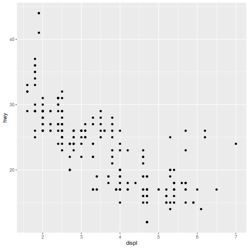
Figure 4
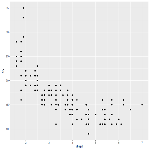
Image 1 of 1: ‘Scatter plot of displacement vs city fuel efficiency with data points.’
Explore Relationships
Figure 1
Image 1 of 1: ‘Scatter plot of displacement vs city fuel efficiency with data points coloured by class.’
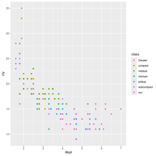
Figure 2
Image 1 of 1: ‘Scatter plot of displacement vs city fuel efficiency with data points coloured by class and shaped like triangles.’
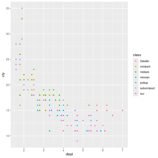
Figure 3
Image 1 of 1: ‘Scatter plot of displacement vs city fuel efficiency with data points coloured by class and shaped like triangles.’
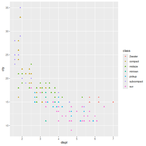
Figure 4
Image 1 of 1: ‘Scatter plot of displacement vs city fuel efficiency with data points size according to the value of city mileage and coloured orange.’
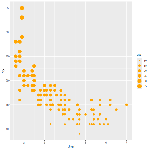
Figure 5
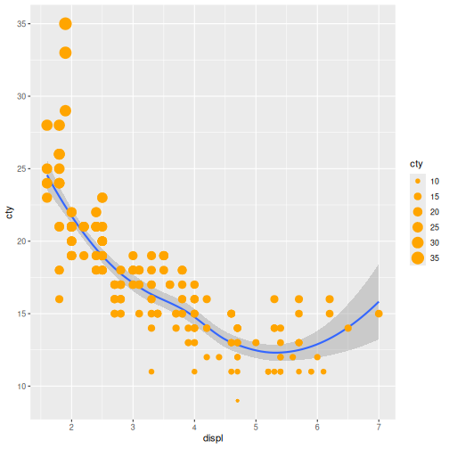
Image 1 of 1: ‘Scatter plot of displacement vs city fuel efficiency with data points sized by city miledage and coloured orange. It includes a blue trendline with shaded confidence interval on top of the points.’
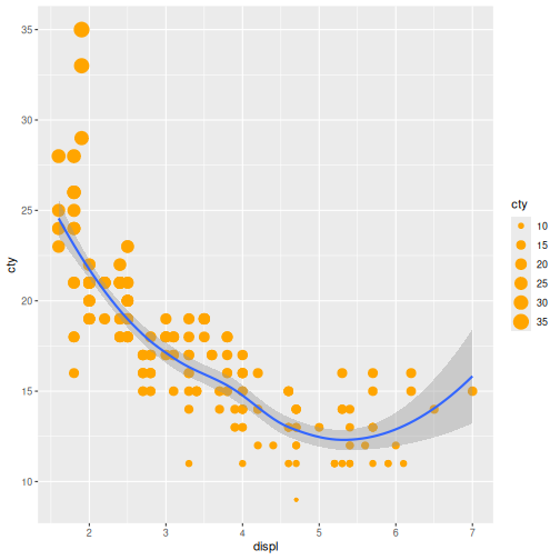
Figure 6
Image 1 of 1: ‘Scatter plot of displacement vs city fuel efficiency with data points sized by city miledage and coloured orange. It includes a blue trendline with shaded confidence interval below the points.’
Understand Distributions
Figure 1
Image 1 of 1: ‘Density plot of highway fuel efficiency.’
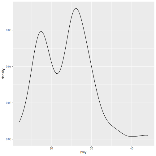
Figure 2
Image 1 of 1: ‘Density plot of city fuel efficiency.’
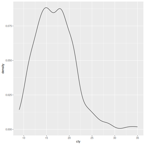
Figure 3
Image 1 of 1: ‘Density plot of highway fuel efficiency filled with colour for each class.’
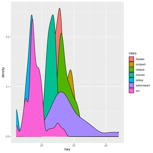
Figure 4
Image 1 of 1: ‘Density plot of city fuel efficiency filled with colour for each class.’
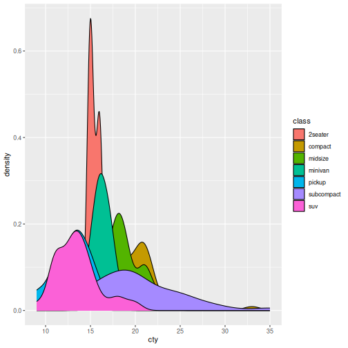
Figure 5
Image 1 of 1: ‘Histogram of highway fuel efficiency with the default 30 bins.’
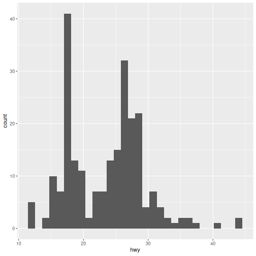
Figure 6
Image 1 of 1: ‘Density plot of city fuel efficiency filled with colour for each class.’
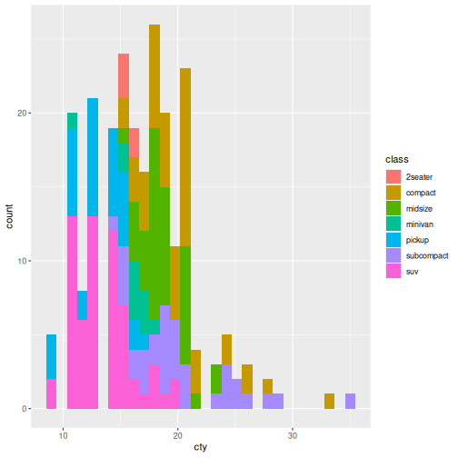
Compare Groups
Figure 1
Image 1 of 1: ‘Boxplot of highway fuel efficiency.’
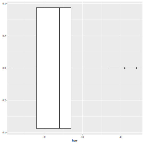
Figure 2
Image 1 of 1: ‘Boxplot of highway fuel efficiency.’
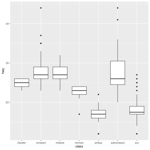
Figure 3
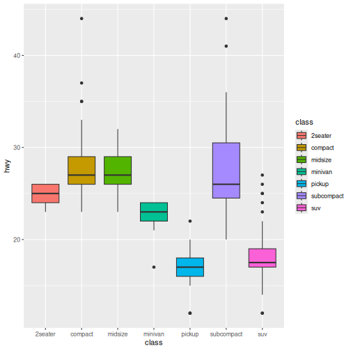
Image 1 of 1: ‘Boxplot of highway fuel efficiency.’
Explore Composition
Figure 1
Image 1 of 1: ‘Bar plot showing the number of mpg observations for each class of vehicle .’
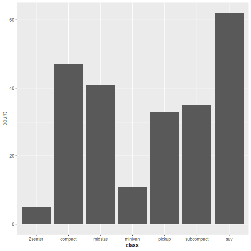
Figure 2
Image 1 of 1: ‘Bar plot showing the number of mpg observations for each class of vehicle .’
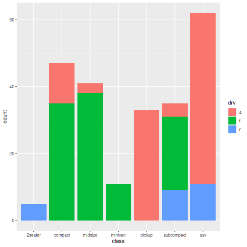
Figure 3
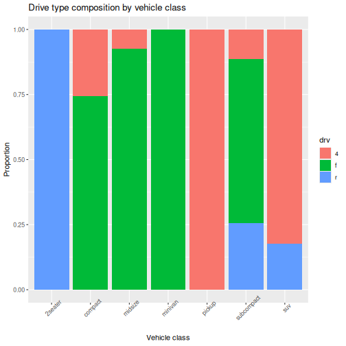
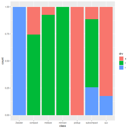
Image 1 of 1: ‘Bar plot showing the proportion of mpg observations for each class of vehicle and drive type.’
Communicate Results
Figure 1
Image 1 of 1: ‘Bar plot of highway fuel efficiency for each class of vehicle.’
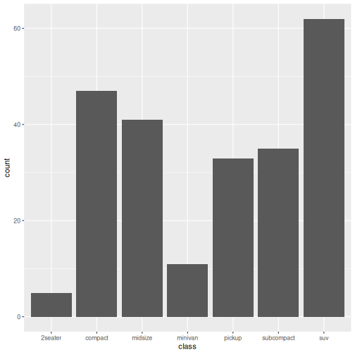
Figure 2
Image 1 of 1: ‘Bar plot of highway fuel efficiency for each class of vehicle.’
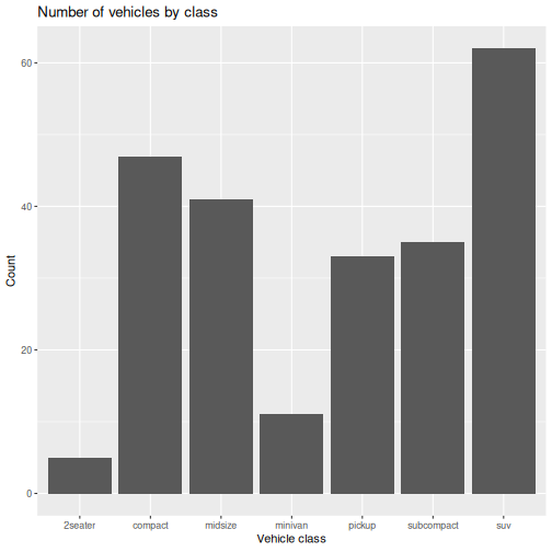
Figure 3
Image 1 of 1: ‘Bar plot showing the number of mpg observations for each class of vehicle .’
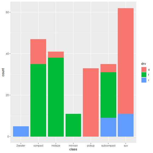
Figure 4
Image 1 of 1: ‘Bar plot showing the number of mpg observations for each class of vehicle. Each drive type has own colour and its own panel.’
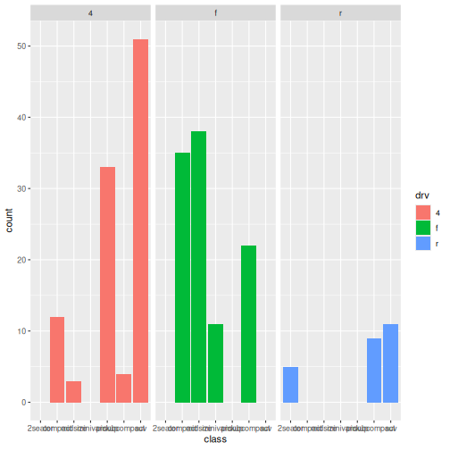
Figure 5
Image 1 of 1: ‘Bar plot showing the number of mpg observations for each class of vehicle. Each drive type has its own panel. Labels are rotated 45 degrees to improve readability.’
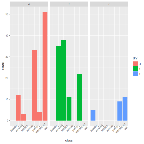
Figure 6
Image 1 of 1: ‘Bar plot showing the number of mpg observations for each class of vehicle. Each drive type has its own panel.’