
ggplot2 Essentials
Last updated on 2026-10-02 | Edit this page
Estimated time: 30 minutes
Overview
Questions
- How do I create plots with ggplot2?
- How do I save the plots I created?
Objectives
- Use ggplot2 to generate plots.
- Know the three components to a basic ggplot2: data, aesthetic mappings, geometric objects.
- Manipulate the aesthetic mappings of a plot.
- Save a plot created with ggplot() to disk.
Plotting is a key component of exploratory data analysis and a powerful way to identify patterns, trends, and relationships between variables in your dataset.
In this lesson, we will use the ggplot2 package, a
widely used system for creating clear and flexible data visualisations
in R.
ggplot2 is built on the grammar of graphics, which is
the idea that any plot can be built from the same set of components: a
data set, mapping aesthetics, and
graphical layers:
Data are the data that you, the user, provide.
Aesthetic Mappings are what connect the data to the graphics. They tell
ggplot()how to use your data to affect how the graph looks, such as changing what is plotted on the X or Y axis, or the size or colour of different data points.Geometric objects (geoms) are the parts of the plot that we can see, such as points, lines, or bars. Each geom creates a different type of plot (e.g. scatter plots, histograms, bar charts). In
ggplot2, plots are built up in layers, with each geom added as new layer.
Data
In this lesson we will use the mpg dataset, which is
included with the ggplot2 package. This dataset contains
fuel economy data for a range of cars. Fuel efficiency is recorded in
miles per gallon (mpg), which is commonly used in the United States (in
Australia, we more often use litres per 100 km). Higher values indicate
better fuel efficiency.
Because mpg is built into ggplot2, we can
use it directly without needing to load an external file.
Setup
We are going to be using functions from the
ggplot2 package to create visualizations
of data. Functions are predefined bits of code that automate more
complicated actions. R itself has many built-in functions, but we can
access many more by loading other packages of functions
and data into R.
If you don’t have a blank, untitled script open yet, go ahead and
open one with Shift+Cmd+N (Mac) or Shift+Ctrl+N
(Windows). Then save the file to your scripts/ folder, and
title it workshop_code.R.
Earlier, you had to install the ggplot2
package by running install.packages("tidyverse"). That
installed the package onto your computer so that R can access it. In
order to use it in our current session, we have to load
the package using the library() function.
R
library(ggplot2)
We will use the mpg dataset that is prepackaged with
ggplot.
In R, the str() function provides a summary of the
dataset’s internal structure. It tells you the total number of
observations (rows) and variables (columns), the data type of each
column (e.g., numeric, character, or factor), and displays the first few
values of each variable.
R
str(mpg)
OUTPUT
tibble [234 × 11] (S3: tbl_df/tbl/data.frame)
 $ manufacturer: chr [1:234] "audi" "audi" "audi" "audi" ...
 $ model       : chr [1:234] "a4" "a4" "a4" "a4" ...
 $ displ       : num [1:234] 1.8 1.8 2 2 2.8 2.8 3.1 1.8 1.8 2 ...
 $ year        : int [1:234] 1999 1999 2008 2008 1999 1999 2008 1999 1999 2008 ...
 $ cyl         : int [1:234] 4 4 4 4 6 6 6 4 4 4 ...
 $ trans       : chr [1:234] "auto(l5)" "manual(m5)" "manual(m6)" "auto(av)" ...
 $ drv         : chr [1:234] "f" "f" "f" "f" ...
 $ cty         : int [1:234] 18 21 20 21 16 18 18 18 16 20 ...
 $ hwy         : int [1:234] 29 29 31 30 26 26 27 26 25 28 ...
 $ fl          : chr [1:234] "p" "p" "p" "p" ...
 $ class       : chr [1:234] "compact" "compact" "compact" "compact" ...
Data dictionary
The main variables we will use in this lesson are:
- displ: engine size (litres)
- hwy: highway fuel efficiency (miles per gallon)
- cty: city fuel efficiency (miles per gallon)
- class: type of car (e.g. SUV, compact)
- drv: drive type (front-wheel, rear-wheel, 4-wheel)
Know your data
Before creating any plots, it’s useful to briefly explore the dataset to understand what variables are available and what they represent.
Take a minute to explore the dataset:
- What types of variables are included (numeric, categorical)?
- Which variable might you use for the x-axis if you wanted to explore engine size?
- Which variable could you use for the y-axis to represent fuel efficiency?
- Is there a categorical variable you could use to group points?
- numeric: displ, year, cyl, cty, hwy
- categorical: manufacturer, model, trans, drv, fl, class
- engine size: displacement
- fuel efficiency: mpg
- any of the categorical variables can be used to group points
Plotting with ggplot2
Let’s start off building an example using the mgp
data.
The most basic function is ggplot(), which lets R know
that we’re creating a new plot. Any of the arguments we give the
ggplot() function are the global options for the
plot - they apply to all layers on the plot.
R
ggplot(data = mpg)

Here we called ggplot() and told it what data we want to
show on our plot. This is not enough information to actually draw
anything. However, it does create a blank plot that helps demonstrate
how the components are put together. We’re essentially providing the
base layer for other elements to be added on to.
Next we’re going to add in the mapping aesthetics
using the aes() function. aes() tells
ggplot() how variables in the data map to
aesthetic properties of the plot, such as which columns of the
data should be used for the x and y
locations.
R
ggplot(data = mpg,
       mapping = aes(x = displ, y = hwy))
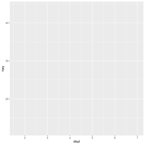
Here we told ggplot() we want to plot the “displ” column
of the data frame on the x-axis, and the “hwy” column on the y-axis.
Notice that we didn’t need to explicitly pass aes these
columns (e.g. x = mpg[, "disp"]). This is because
ggplot() is designed to look in the data
for that column!
Notice again that we still don’t have a plot. The third and final
component needed to make a plot is a geom function to
tell ggplot() how to visually represent the data. For
example, if we want to use points to represent the data
in our plot, we use the geom_point() function.
The + is used to add layers to a plot.
R
ggplot(data = mpg,
       mapping = aes(x = displ, y = hwy)) +
  geom_point()
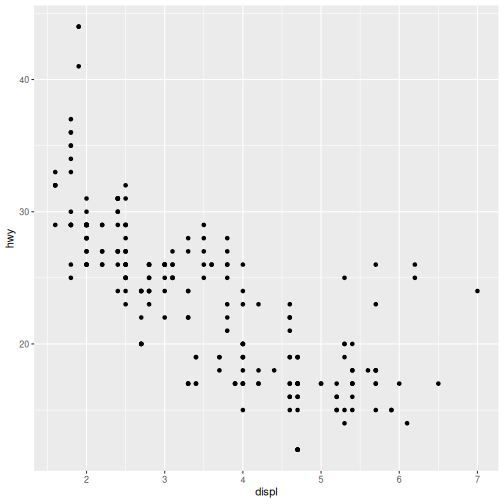
There we have it! A scatter plot of points that represents the relationship between x (‘displacement’) and y (‘highway fuel efficiency’) in our dataset.
These three components — data, aesthetic
mappings, and geoms — are all you need to
create a basic plot in ggplot2.
In the rest of this lesson, we will build on this foundation to create different types of visualisations and explore how to adapt them for different questions.
Aesthetic Mappings
Modify the example so that the plot shows how city fuel efficiency relates to engine displacement.
- What can we say about the relationship?
- How does it compare to the relationship with highway efficiency?
- (BONUS) How could we modify this plot to make the difference with highway more obvious?
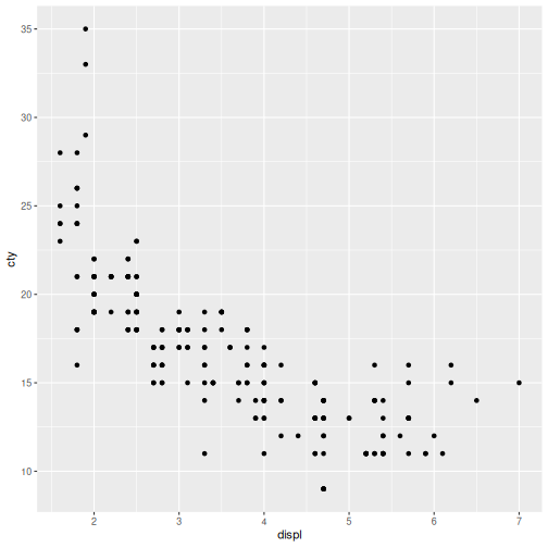
- City fuel efficiency (cty) and engine displacement (displ) have a
strong negative correlation.
- As engine displacement (size in liters) increases, city fuel economy (miles per gallon) noticeably decreases, meaning larger engines consume significantly more fuel.
- Highway miles per gallon (hwy) are generally higher than city miles.
- Because of this, the hwy is higher on the y-axis and stretches across a slightly wider range.
- We could put both sets of data on the same plot.
R
ggplot(data = mpg,
       mapping = aes(x = displ, y = cty)) +
  geom_point()
Saving the plot
The ggsave() function allows you to save a plot created
with ggplot2 quickly and easily with just a filename:
R
ggsave(filename = "fig/my_ggplot.png")
OUTPUT
Saving 7 x 7 in imageNotice that we did not provide any additional arguments to
ggsave().
- If we omit the
plotargument, it will automatically save the last plot you created withggplot. - If we omit the
deviceargument, it will use the file extension to determine the device.
In this episode, we introduced the grammar of graphics and the core
components of ggplot2: data, aesthetic mappings, and geometric layers.
Using these components, we created our first plot with
geom_point() and explored how variables can be mapped to
visual properties such as colour.
In the next episodes, we will build on these basics to explore our dataset in more detail. We will use a selection of commonly used geoms to examine relationships between variables, the distribution of individual variables, differences between groups, and the composition of our data.
-
ggplot2can quickly create simple plots for exploratory data analysis. -
ggplot2plots are built around the grammer of graphics where the key components of a plot can be extended with the additional geom layers.