
Understand Distributions
Last updated on 2026-10-02 | Edit this page
Estimated time: 30 minutes
Overview
Questions
- How can we explore a single variable in ggplot2?
- What does the shape of a variable’s distribution tell us?
- How can we compare distributions across groups?
Objectives
- Create density plots to explore the distribution of a single variable
- Map a categorical variable to fill to compare distributions
- Describe distributions in terms of shape, spread, and overlap
- Recognise how density plots and histograms represent the same idea
In the previous episode, we used scatterplots to explore relationships between two variables.
Now we’re going to shift focus and instead of asking, How do two variables relate?, we ask, What does one variable look like on its own?. This is called a distribution.
What is a distribution?
So far, we’ve been looking at relationships between variables. Now we’re going to focus on a single variable at a time.
A distribution tells us:
- What values occur
- How often they occur
- How those values are spread out
Visualising a distribution
We’ll start by looking at highway fuel efficiency (hwy)
in the mpg dataset.
R
ggplot(data = mpg,
       mapping = aes(x = hwy)) +
  geom_density()
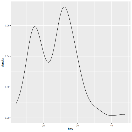
If we map a single variable (hwy) to the x-axis,
geom_density() creates a smooth curve. The height shows
where values are more common.
Interpreting a distribution
When reading a distribution, focus on:
-
Shape
- Is it symmetric or skewed left or right?
- One peak or multiple?
-
Spread
- Are values tightly clustered or widely spread out?
-
Concentration
- Where do most values fall?
Distribution Interpretation
Describe the distribution of highway fuel efficiency.
What else can we say about this plot?
Answers may vary.
- The distribution appears bimodal, with peaks around 15 mpg and 26 mpg.
- Most vehicles have highway fuel efficiency between approximately 20 and 30 mpg.
- There are relatively few vehicles with very high highway fuel efficiency, producing a tail towards the higher values.
- The presence of two peaks suggests the data may contain distinct groups of vehicles with different fuel-efficiency characteristics.
- On its own, the plot shows the shape and spread of highway fuel efficiency, but it does not explain why these patterns occur.
City Fuel Efficiency Density plot
Create a density plot of city fuel efficiency (cty).
- How does it compare to
hwy? - Does it look more or less spread out?
R
ggplot(data = mpg,
       mapping = aes(x = cty)) +
  geom_density()
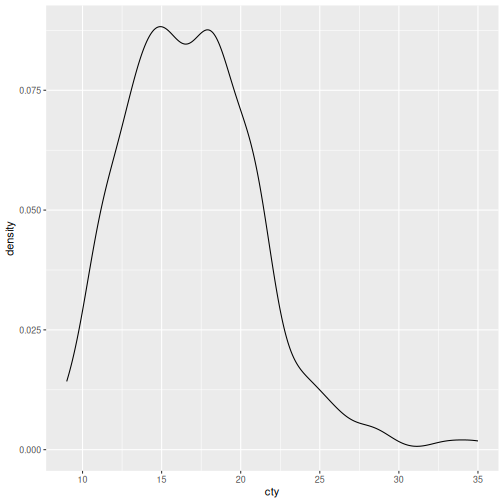
- The distribution is concentrated around 15-18 mpg.
- Most vehicles have city fuel efficiency between approximately 12 and 20 mpg.
- The distribution is slightly right-skewed, with a small number of highly fuel-efficient vehicles extending the upper tail.
- Compared with hwy, the values occur at lower fuel-efficiency levels.
- The distribution appears somewhat narrower than the highway fuel-efficiency distribution.
Comparing distributions with groups
Just like in the relationships episode, we can use aesthetics to reveal more information.
Here, we’ll compare fuel efficiency across vehicle
class:
R
ggplot(data = mpg,
       mapping = aes(x = hwy, fill = class)) +
  geom_density()
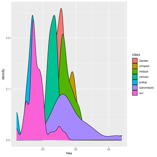
When we set fill to class each class gets
its own distribution. The curves overlap so we can compare them
directly.
Notice how some groups overlap heavily — this can make comparisons harder.
Group Plot Interpretation
- Which vehicle class tends to have higher fuel efficiency?
- Which class has the widest spread?
- Which classes look similar or very different?
Answers may vary.
- Compact cars tend to have the highest highway fuel efficiency.
- SUVs and pickups tend to have the lowest highway fuel efficiency.
- Subcompacts have the widest spread.
- Many of the distributions overlap, particularly for compact, midsize, and subcompact vehicles.
Distribution of Classes Interpretation
Create a density plot of city fuel efficiency (cty) for
different classes of vehicles.
- How does it compare to
hwy? - Does it look more or less spread out?
R
ggplot(data = mpg,
       mapping = aes(x = cty, fill = class)) +
  geom_density()
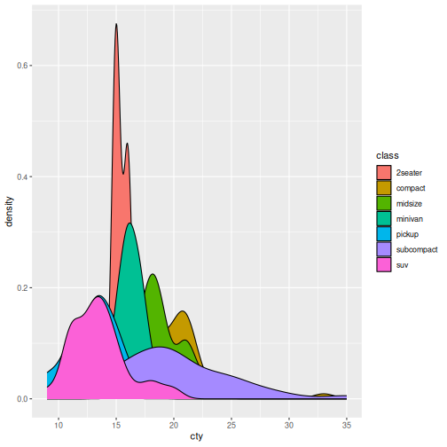
- The overall pattern is similar to the highway fuel-efficiency plot, but all distributions are shifted toward lower values because city fuel efficiency is lower than highway fuel efficiency.
- Compact and subcompact vehicles tend to have the highest city fuel efficiency.
- SUVs and pickups tend to have the lowest city fuel efficiency.
- The spread within each class is generally smaller than for highway fuel efficiency.
- There is still substantial overlap between several classes, particularly compact, midsize, and subcompact vehicles.
Why density plots?
Density plots are useful because they:
- Show the overall shape clearly
- Are smooth, reducing noise
- Make comparisons easier when multiple groups overlap
Histograms
So far, we’ve used density plots to visualise distributions. Density plots provide a smooth view of the data.
Another common way to display a distribution is with a histogram. Instead of drawing a smooth curve, a histogram groups values into bins and counts how many observations fall into each bin.
R
ggplot(data = mpg,
       mapping = aes(x = hwy)) +
  geom_histogram()
OUTPUT
`stat_bin()` using `bins = 30`. Pick better value `binwidth`.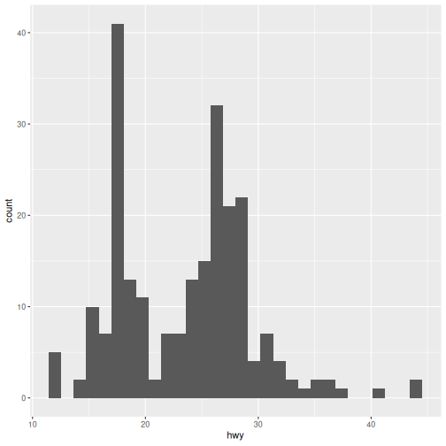
Both density plots and histograms show the same underlying distribution.
- Density plots emphasise the overall shape.
- Histograms show the underlying counts.
- Histograms depend on how the data are split into bins.
Density plots and histograms
Density plots show the overall shape of a distribution using a smooth curve.
Histograms show the same distribution using bars and counts.
Same underlying data, different representation.
Colour histogram by class (optional)
Use class to colour the histogram.
Hint: use aes().
What problems do you notice compared to density plots?
Most learners will move the fill argument directly from
the ggplot layer to the geom_histogram() layer. This will
break unless you use the aes() function to map each
class.
R
ggplot(data = mpg,
       mapping = aes(x = cty)) +
  geom_histogram(aes(fill = class))
OUTPUT
`stat_bin()` using `bins = 30`. Pick better value `binwidth`.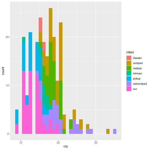
In this episode, we shifted from exploring relationships between variables to understanding individual variables through their distributions.
We used density plots to visualise how values are spread, and extended what we learned about aesthetic mappings by using fill to compare distributions across vehicle classes.
This introduced an important idea: while mappings like fill can add insight, they can also introduce overlap and complexity, especially as the number of groups increases.
In the next episode, we’ll build on this by looking more closely at
how ggplot2 handles groups, and how we can control and
organise them to make our visualisations clearer and more
informative.
- A distribution describes how a single variable’s values are spread.
-
geom_density()creates a smooth representation of that distribution. - Mapping
fillallows comparison across groups. - Focus on shape, spread, and overlap
- Histograms show the same idea, but with binned counts instead of a smooth curve.