
Compare Groups
Last updated on 2026-10-02 | Edit this page
Estimated time: 45 minutes
Overview
Questions
- How can we summarise a distribution?
- What key information helps us understand a distribution quickly?
- How can we compare these summaries across groups?
Objectives
- Interpret boxplots using median, spread, and outliers
- Explain why boxplots are commonly used in statistical analysis
- Create boxplots to compare distributions across groups
In the previous episode, we used density plots nad histograms to look at the distributions of single variables.
These show the overall shape of the data. But sometimes we’re less interested in the full shape, and more in a quick summary. To do that, we can use a different type of plot.
Introducing Boxplots
A boxplot is a visual summary of numerical data that displays its distribution, spread, and skewness in a compact way.
We replace geom_density() with
geom_boxplot() in our plot.
R
ggplot(data = mpg,
       mapping = aes(x = hwy)) +
  geom_boxplot()
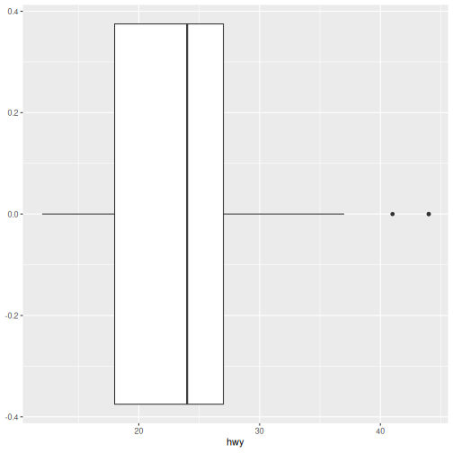
Here we have single boxplot of highway fuel efficiency. This looks quite different to everything we’ve seen so far. Unlike density plots, this doesn’t show the full shape — it summarises the distribution.
What do you think this plot is showing?
How to read a boxplot
Each boxplot shows:
- The Median is the line inside the box and indicates the “middle” value.
- The Spread or middle 50% is the box itself and shows where most values lie.
- Whiskers extend to typical lower and upper values.
- Outliers are individual points beyond the whiskers.
Interpreting the plot
- Where is the median fuel efficiency?
- How spread out are the middle values?
- Are there any outliers?
- The median highway fuel efficiency is approximately 24 mpg.
- The middle 50% of observations lie roughly between 18 and 27 mpg.
- Several high-fuel-efficiency vehicles appear as outliers above the upper whisker.
- There are few, if any, obvious low-end outliers.
Density vs boxplot
Density plots show full shape, good for fewer groups.
Boxplots show summary, better for many groups.
Same underlying data, different level of detail.
Do More With Boxplots
Boxplots can be used in many ways to extract more information from our data. They are especially common in statistical analysis and reporting.
So far, we’ve summarised a single distribution.
What if we want that same summary for each class of vehicle?
To get a boxplot for each class, we’re actually making
two different changes here — first how we represent the data, and then
how we organise it into groups.
A boxplot doesn’t plot every data point. It plots a summary of a group of data points.
Therefore we need:
- a numeric variable to summarise (hwy)
- a grouping variable (class)
R
ggplot(data = mpg,
       mapping = aes(x = class, y = hwy)) +
  geom_boxplot()
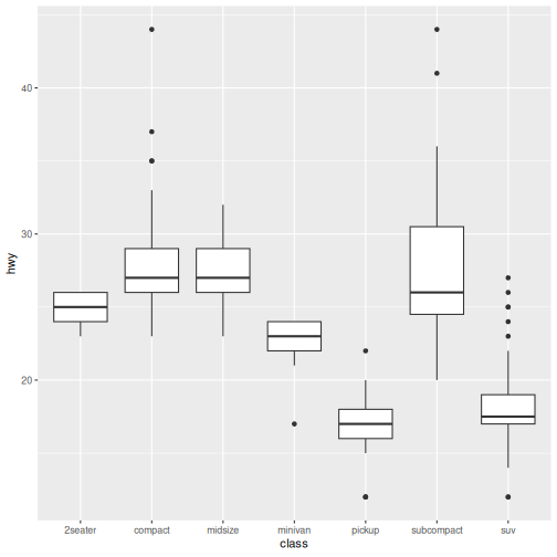
Here, each box represents the distribution of one group. The summary values we learned above are calculated for each class of vehicle.
Note Mapping Change
geom_density: x = hwy
geom_boxplot (grouped): x = class, y = hwy
Group Plot Interpretation
- Which vehicle class tends to have higher fuel efficiency?
- Which class has the widest spread?
- Which classes look similar or very different?
- Are many outliers?
Answers may vary.
- Compact and subcompact vehicles tend to have the highest median highway fuel efficiency.
- SUVs and pickups tend to have the lowest median highway fuel efficiency.
- Subcompact vehicles show one of the widest spreads.
- Compact and midsize vehicles have similar distributions.
- SUVs and pickups have similar distributions and are clearly different from compact cars.
- Several groups contain outliers, particularly at higher fuel-efficiency values.
Add fill to boxplot
Reuse what we already know and use fill to colour each
class to help visually separate groups.
R
ggplot(data = mpg,
       mapping = aes(x = class, y = hwy, fill = class)) +
  geom_boxplot()
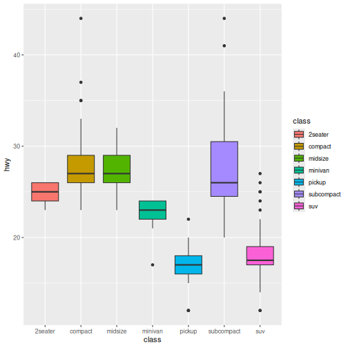
In this episode, we moved from viewing the full shape of distributions to summarising them using boxplots. This allowed us to compare groups more clearly using a small number of key values.
Next, we’ll shift from comparing groups to understanding how observations make up a whole, using visualisations designed for proportions and composition.
- Boxplots summarise distributions using median, spread, and outliers
- Mapping x = group and y = numeric creates group comparisons
- Boxplots are useful when comparing many groups
- They trade detail (shape) for clarity (summary)