
Explore Relationships
Last updated on 2026-10-02 | Edit this page
Estimated time: 30 minutes
Overview
Questions
- How can scatterplots be used to explore relationships between variables?
- How do aesthetic mappings and layers help reveal patterns in data?
Objectives
- Create scatterplots to explore relationships between variables.
- Distinguish between aesthetic mappings and aesthetic settings.
- Add and modify layers in a ggplot.
We’ve seen how plots can be created quickly using the key components
of a ggplot and we know that scatter plots can be used to
explore relationships between variables in our dataset.
Let’s take a closer look at the relationship between engine size
(displ) and city fuel efficiency (cty). We
will also explore how additional aesthetic mappings and layers can help
reveal patterns in the data.
Mapping and Setting Aesthetics
So far, we have mapped variables to the x- and y-axes.
We can also control other visual properties, such as colour, size, and shape in two ways.
We can map them to variables in our data, or set them to a fixed value that is applied to all observations.
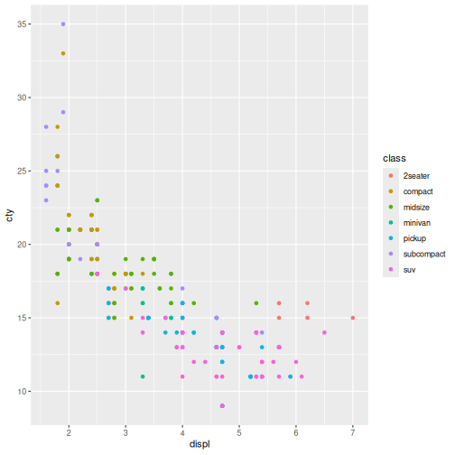
For example, we can map a colour to each
class of vehicle.
R
ggplot(data = mpg,
       mapping = aes(x = displ, y = cty,
                     colour = class)) +
  geom_point()
Aesthetics - Colour trends
- What trends do the colours bring out in the data?
- Are they what you expected?
- Vehicle classes form distinct clusters.
- SUVs and pickups generally have larger engines (higher displ) and lower city fuel efficiency (cty).
- Compact and subcompact cars generally have smaller engines and higher fuel efficiency.
- The overall negative relationship between engine size and fuel efficiency becomes clearer because we can see which vehicle classes - occupy different regions of the plot.
- The pattern is largely what we would expect: larger vehicle classes tend to be less fuel efficient than smaller vehicle classes.
In the above example we used a variable to control the colouring of the datapoints.
We can also set a fixed value.
Lets modify the transparency of the points, using the
alpha argument, which is especially helpful when you have a
large amount of data which is very clustered.
R
ggplot(data = mpg,
       mapping = aes(x = displ, y = cty,
                     colour = class)) +
  geom_point(shape = 17)
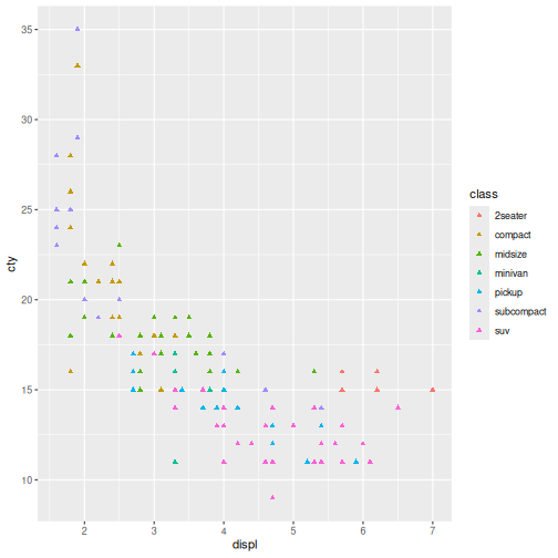
Notice how all of the points are shaped like triangles, not just the ones of a particular class.
Finally, we can map variables and set values for aethestics for a geom.
In this example, we will move the colour by
class aesthetic to the specific
geom_point().
This plot should look like the one above, we’ve only moved the colooring to the layer in order to make more complex visualisations.
R
ggplot(data = mpg,
       mapping = aes(x = displ, y = cty)) +
  geom_point(aes(colour = class), shape = 17)
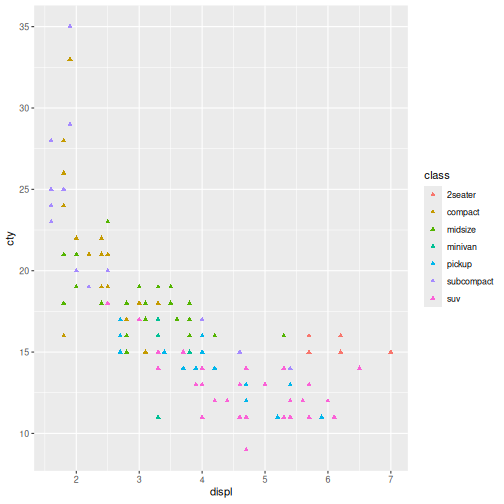
Here the colour mapping only applies to the points because it was
specified within geom_point().
This allows different layers to use different aesthetic mappings.
Aesthetic Mapping vs Setting
- Inside aes() = map an aesthetic to a variable in the data.
- Outside aes() = set an aesthetic to a fixed value.
| Goal | Code |
|---|---|
| Colour by car class | aes(colour = class) |
| Make all points blue | colour = “blue” |
| Size by engine size | aes(size = displ) |
| Make all points larger | size = 3 |
Mapping vs Setting
Modify the point layer in the previous example so that:
- all points are blue
- point size depends on
cty
Hint: use size argument to change the point size.
Answers may vary.
Notice that the city argument is supplied inside the
layer aes() function whereas the colour
argument is supplied outside of aes(). This means that
colour applies to all data points on the graph and is not
related to a specific variable.
R
ggplot(data = mpg,
       mapping = aes(x = displ, y = cty)) +
  geom_point(aes(size = cty), colour = "orange")
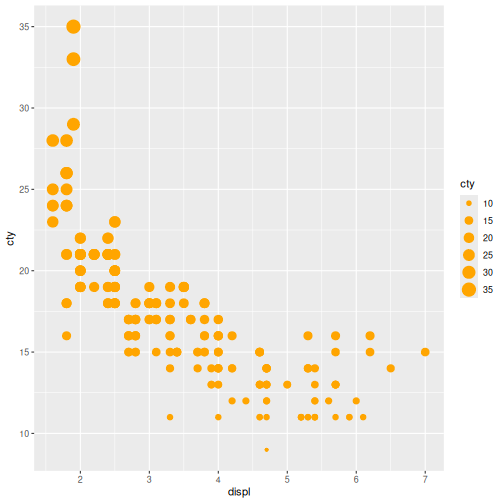
Changing the way a dataset is displayed visually is useful for distinguishing patterns and extracting information.
Taking it one step further, we can add more geoms to our plot to highlight relationships in the data.
Layers
Layers in ggplot2 are building blocks stacked on top of
each other to create more and more complex plots.
Let’s add a geom_smooth() layer to the plot. Recall we
use the + symbol to stack the layers:
R
ggplot(data = mpg,
       mapping = aes(x = displ, y = cty)) +
  geom_point(aes(size = cty), colour = 'orange') +
  geom_smooth()
OUTPUT
`geom_smooth()` using method = 'loess' and formula = 'y ~ x'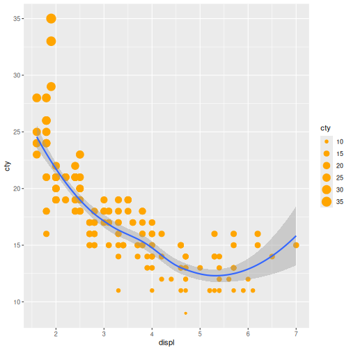
The geom_smooth() layer adds a trend line to the plot,
making the overall relationship between engine size and fuel efficiency
easier to see. In this case, it highlights that fuel efficiency tends to
decrease as engine size increases.
It’s important to note that each layer is drawn on top of the previous layer. In the plot above, the line has been drawn on top of the points.
What if we wanted to see the points on top of the lines?
Layer Order Matters
Switch the order of the point and smooth layers from the previous example.
- What happened?
To demonstrate, rearrange the drawing order.
The points now get drawn over the line!
If we look closely the smooth line was drawn first, followed by the points.
R
ggplot(data = mpg,
       mapping = aes(x = displ, y = cty)) +
  geom_smooth() +
  geom_point(aes(size = cty), colour = 'orange')
OUTPUT
`geom_smooth()` using method = 'loess' and formula = 'y ~ x'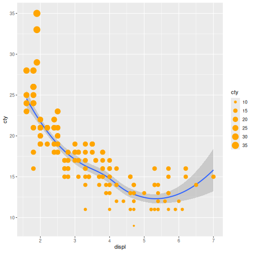
In this episode, we used scatterplots to explore the relationship between engine size and fuel efficiency.
We learned how aesthetic mappings can reveal additional patterns in the data and how aesthetic settings can be used to modify the appearance of a plot.
Finally, we introduced layers and used geom_smooth() to
highlight overall trends.
In the next episode, we will shift our focus from relationships between variables to the distribution of individual variables using density plots.
- Scatterplots are useful for exploring relationships between variables.
- Aesthetic mappings connect variables in the data to visual properties such as colour.
- Aesthetic settings apply the same visual property to all observations.
-
ggplot2plots can be built up by adding layers with+. - Different layers can have different aesthetic mappings.