
Communicate Results
Last updated on 2026-10-02 | Edit this page
Overview
Questions
- How can we make plots easier to interpret?
- When is it helpful to split a plot into multiple panels?
- How can labels improve communication?
Objectives
- Use
facet_wrap()to create multiple panels from a grouped dataset - Add informative titles and axis labels with
labs() - Improve readability by rotating crowded axis labels with
theme() - Refine an existing plot to better communicate a message
So far we’ve focused on creating plots to answer different questions:
- Relationships
- Distributions
- Group comparisons
- Composition
The final step is communication.
Even when a plot contains useful information, the message may not be
obvious to the audience. ggplot2 provides tools that help
us organise information, direct attention, and make visualisations
easier to interpret.
Improving labels
Let’s start with a plot we’ve seen before:
R
ggplot(data = mpg,
       mapping = aes(x = class)) +
  geom_bar()
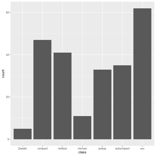
The plot communicates the data, but the labels come directly from the dataset.
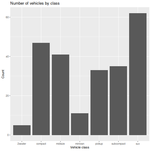
We can make the plot more informative using labs():
R
ggplot(data = mpg,
       mapping = aes(x = class)) +
  geom_bar() +
  labs(
    x = "Vehicle class",
    y = "Count",
    title = "Number of vehicles by class"
  )
Splitting plots with facets
Sometimes a single plot contains too much information.
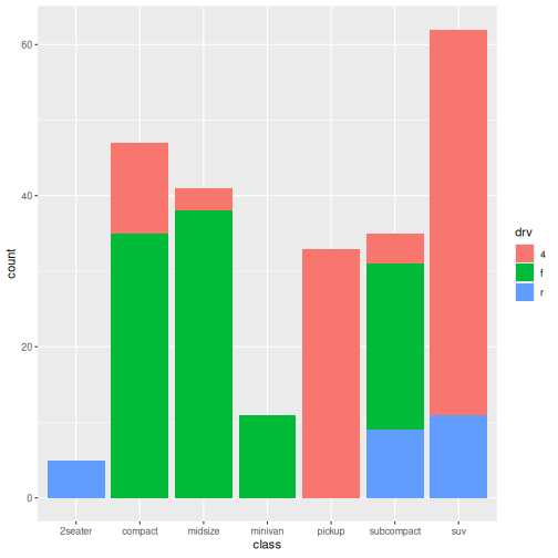
In our composition episode, we examined vehicle classes and drive type:
R
ggplot(data = mpg,
       mapping = aes(x = class, fill = drv)) +
  geom_bar()
Instead of showing everything in one panel, we can create a separate panel for each drive type:
R
ggplot(data = mpg,
       mapping = aes(x = class, fill = drv)) +
  geom_bar() +
  facet_wrap(~ drv)
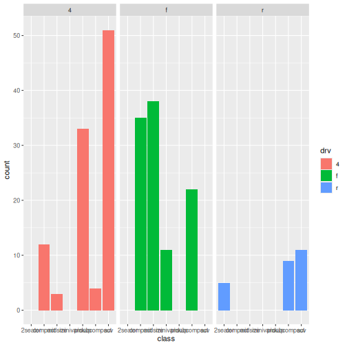
What happened?
- A separate plot is created for each drive type.
- All panels use the same scale.
- Comparing patterns between groups becomes easier.
Faceting is useful when:
- Several groups overlap in a single plot
- You want to compare patterns between groups
- Colour alone is not enough to separate information
Facet Plot Interpretation
- Which drive type includes the most vehicle classes?
- Are some vehicle classes only found in one panel?
- Is the pattern easier to interpret than the single combined plot? Why?
- The front-wheel-drive panel contains the largest variety of vehicle classes.
- Some vehicle classes appear predominantly in a single panel, such as two-seaters in rear-wheel drive and many SUVs in four-wheel drive.
- The faceted version is easier to interpret because overlapping colours are eliminated and each drive type can be examined independently.
Improving readability
Sometimes labels become crowded.
Consider the facet plot we just created. Notice that the x-axis labels are becoming crowded and difficult to read. How can we fix that?
We can rotate axis text to make it easier to read:
R
ggplot(data = mpg,
       mapping = aes(x = class, fill = drv)) +
  geom_bar() +
  facet_wrap(~ drv) +
  theme(axis.text.x = element_text(angle = 45))
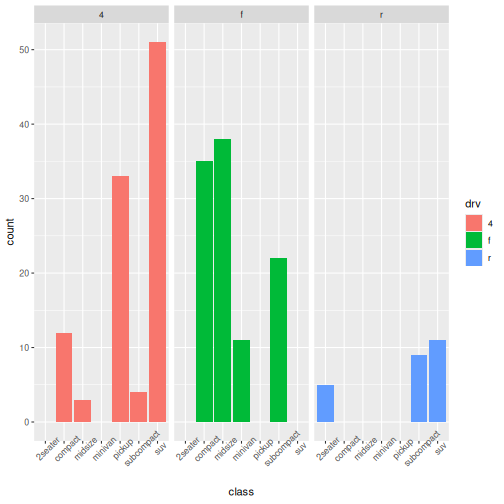
Rotating labels prevents overlapping text, improves readability, and requires only a small modification.
Make a plot publication-ready
Choose one plot from a previous episodes.
Improve it by:
- Adding a title
- Improving axis labels
- Rotating labels if necessary
Answers may vary.
R
ggplot(data = mpg,
       mapping = aes(x = class, fill = drv)) +
  geom_bar(position = "fill") +
  labs(
    title = "Drive type composition by vehicle class",
    x = "Vehicle class",
    y = "Proportion"
  ) +
  theme(axis.text.x = element_text(angle = 45))
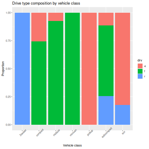
In this episode, we focused on communicating information clearly using labels, facets, and simple formatting improvements.
Throughout this workshop, we have used ggplot2 to
explore relationships, distributions, group comparisons, and
composition.
Clear communication helps ensure those visualisations can be understood and used by others.
-
labs()adds informative titles and axis labels -
facet_wrap()creates a panel for each group - Faceting can make complex plots easier to interpret
- Small theme adjustments can improve readability
- Effective visualisation includes clear communication, not just correct code