
Explore Composition
Last updated on 2026-10-02 | Edit this page
Overview
Questions
- How can we show how data are divided into parts?
- What does each category contribute to the whole?
Objectives
- Create bar plots to show counts and proportions
- Map categorical variables to visualise composition
- Interpret plots as parts of a whole
- Recognise when bar plots are appropriate for composition
In the previous episode, we used boxplots to summarise distributions and compare groups.
Now we’ll look at a different question. How is our data made up?
Instead of shape or summary, we’re interested in composition — how observations are divided into categories.
Counts with bar plots
To start, let’s count how many observations fall into each vehicle
class. As we learned with mapping, we map the group to the
x-axis:
R
ggplot(data = mpg,
       mapping = aes(x = class)) +
  geom_bar()
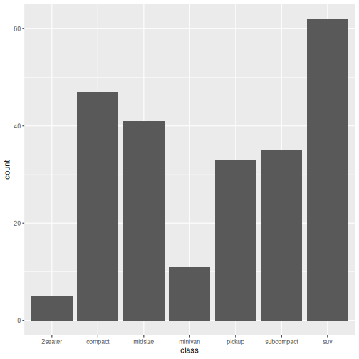
In this plot, class is a categorical variable and
geom_bar() counts the number of observations in each
category. The height of each bar shows how many there are.
Notice that the y-axis shows counts. The taller the bar, the more observations belong to that class.
Interpreting the plot
- Which class appears most often?
- Which appears least often?
- suv
- 2seater
Adding another variable
We can break this down further using fill, just like
before. What if we wanted to know about the drive type (front-wheel,
rear-wheel, 4-wheel) for the vehicles in each class. We use
the drv variable.
R
ggplot(data = mpg,
       mapping = aes(x = class, fill = drv)) +
  geom_bar()
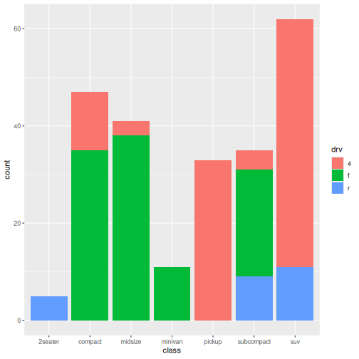
Bars are now split into segments where each segment represents a
level of drv or drive type.
The total height is still the count for each class so now we see composition within groups.
Notice that the overall height of each bar has not changed. We have simply divided each bar into drive-type categories.
Grouped Bar Plot Interpretation
- Which drive types are most common overall?
- Do some classes mostly use one drive type?
- Are some classes more mixed than others?
Answers may vary.
- Front-wheel drive (f) and four-wheel drive (4) vehicles are the most common overall.
- SUVs are dominated by four-wheel drive vehicles.
- Compact and midsize vehicles are mostly front-wheel drive.
- Two-seaters are almost entirely rear-wheel drive (r).
- Some classes are strongly associated with a single drive type, while others contain a mixture of drive types.
Showing proportions
So far, we’ve shown counts.
Sometimes we care about proportions instead — how large each part is relative to the whole.
To show proportions instead of counts, add
position = "fill" as an argument to
geom_bar().
The position argument controls how the stacked sections are arranged.
- position = “stack” (the default) shows counts.
- position = “fill” rescales each bar so it has the same height (100%), allowing us to compare proportions.
R
ggplot(data = mpg,
       mapping = aes(x = class, fill = drv)) +
  geom_bar(position = "fill")
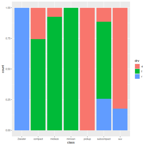
At first glance, this plot looks similar to the previous one. However, notice that all bars now have the same height.
The y-axis has changed from counts to proportions.
Instead of showing how many vehicles belong to each class, the bars now show the relative contribution of each drive type within a class.
This makes it easier to compare composition between classes, regardless of how many vehicles belong to each class.
Proportion Plot Interpretation
- What has changed on the y-axis?
- Why are all bars the same height?
- Which vehicle classes have the most similar composition?
Answers may vary.
- The y-axis now shows proportions rather than counts.
- Every bar has height 1 (100%) because each bar represents the entire class.
- SUVs are almost entirely four-wheel drive.
- Two-seaters are almost entirely rear-wheel drive.
- Compact and midsize vehicles have similar compositions, being dominated by front-wheel drive.
Count vs proportion bars
Counts are the number of observations.
Proportions are the relative contribution.
Same underlying data, different question.
In this episode, we used bar plots to explore the composition of our data.
By mapping variables to fill, we broke counts into parts, and used proportions to compare how groups are made up.
So far, we’ve explored relationships, distributions, summaries, and composition. We’ve learned how to create several kinds of plots. Now let’s make them easier for other people to understand.
- Bar plots show how data are divided into categories
-
geom_bar()counts observations automatically - Mapping
fillshows composition within groups -
position = "fill"converts counts to proportions - Composition focuses on parts of a whole, rather than shape or summary